Sunday, February 14, 2016

Bank of Howardsville Currency Notes; preserving a bit of history.


Some very good friends are in possession of some Bank of Howardsville currency notes.  Its amazing to think that at one time Howardsville, Virginia had its own currency to support the local economy!  I agreed to create something special to preserve them with.


The first step was to measure the bills and design with enough space to accommodate the mat bevel and the overhang from the picture moulding.  This is the most fun part in my opinion because you get to dream and be creative as to what you will include in the composition. 


We had already picked out a frame moulding and a mat style.  The bills were to be framed in a double glass style.  This means the mat and bills are going to be sandwiched between two layers of glass.  By measuring the mat openings to be a quarter of an inch larger than the bills on all sides, once the piece is hung you can see the wall behind it.  You can also take the frame down off the wall and flip it over to inspect the back of the piece as well.


Mat board is a temperamental material to work with.  I discovered I couldn't transfer my drawing with regular graphite paper.  I found the impression needed to get a mark from regular graphite paper would stain the mat paper and not come out once erased.  Because I was drawing in sepia ink, the stains would show through.  If I was illustrating in black ink there would be no problem but black ink would overwhelm the composition.  I had to make my own transfer paper with a 2B pencil.  This made marks light enough not to stain and they would remove easily with eraser.


Here it is finished against the original sketch.


A detailed photograph shows the Howardsville Heritage banner I chose for the top.  It wraps around two barrels full of tobacco on either side.  The banner cradles a bundle of wheat before unfurling down.


One of Virginia's biggest crops was tobacco.  A tall spire of tobacco plant flanks either side of the mat.  It's crowning head of flowers bursts open like fireworks.  Honeysuckle vine creeps through the tobacco to twine itself through the divider in the middle of the mat.


At the bottom of the mat, a terrapin peeks out from beneath the tobacco leaves.  Sacks of flour and a jug of moonshine wait on the shores of the James River as a Batteau floats tethered, awaiting cargo and a journey down the river.  A bag of dried corn cobs has broken open and a fat hen pecks away at the kernels on the cob.

Doing this project has reminded me of how I miss pen and ink drawing and that I should get back into it.  It took 13 hours to complete the work on the mat.  Whew!  That's at least worth a leisurely float down the river!

Sunday, February 7, 2016

Winterfest Cardinal Card


Happy Winterfest! (For all you nerds out there, yes that was a reference to Beauty and the Beast)  I was recently commissioned to do a holiday card design featuring cardinals.  The design was similar to this one but with an edit.  I liked the original image so much I decided to keep it and use it as my own.  I would still like to do something like this except as a Japanese woodblock print but that must wait.  In the meantime, if you'd like to see how it was made, read on!


One day, I'll show you the many sketches I did of cardinals in flight and landing but for now we'll just deal with the pencil sketch of my final.  This particular arrangement is not from a photograph.  My process involves sketching both from life and from photographic references I find online.  Once I've "warmed up" my mind to think of snow, cardinal shapes, and tree branches I start free form sketching what I would like to see.  I liked this particular grouping.


I have gotten into the habit of sketching and inking separately.  I need to get myself a light table like nobody's business but I just haven't committed yet.  I like being able to have the inked version and the sketch separate.  I don't like the idea of "losing" the sketch by erasing it once you have finished inking it.

Anyhow, I knew this image was going to be turned into a polymer plate for printing so I taped a sheet of Denril over my original sketch and did the inking on that.  I think I'll switch to drafting vellum next time because it is absolutely SEXY to draw on.  It just sucks the ink right down and has less smearing.

After inking, I scanned the Denril sheet and colored it digitally.  The image at the start of this post has a gradation of dark brown to lighter brown in the inked areas and the image above has a gradation of black to grey in the inked areas.  The red areas graduate from dark red to a brighter red.  In letterpress printing, this would be achieved by a "rainbow roll" or a "split fountain".  If I were going to make a Japanese woodblock print of this, I would do away with the background hatching and choose to go with numerous subtle "bokashi" or gradations.

Tuesday, February 2, 2016

The Tree of Life Print Collection: A proposed VABC group project

Proposal Meeting at the Virginia Arts of the Book Center

Thursday, March 3rd at 6:30pm


The Tree of Life Print Collection would be a Virginia Arts of the Book Center Group Project which would focus on member's interpretation of the Tree of Life.  Members will produce an edition of 11" x 14" prints that will be encased in a portfolio.  The edition size will depend upon participation as each participating member will receive a set of prints, and extra will be created to donate to the VABC.

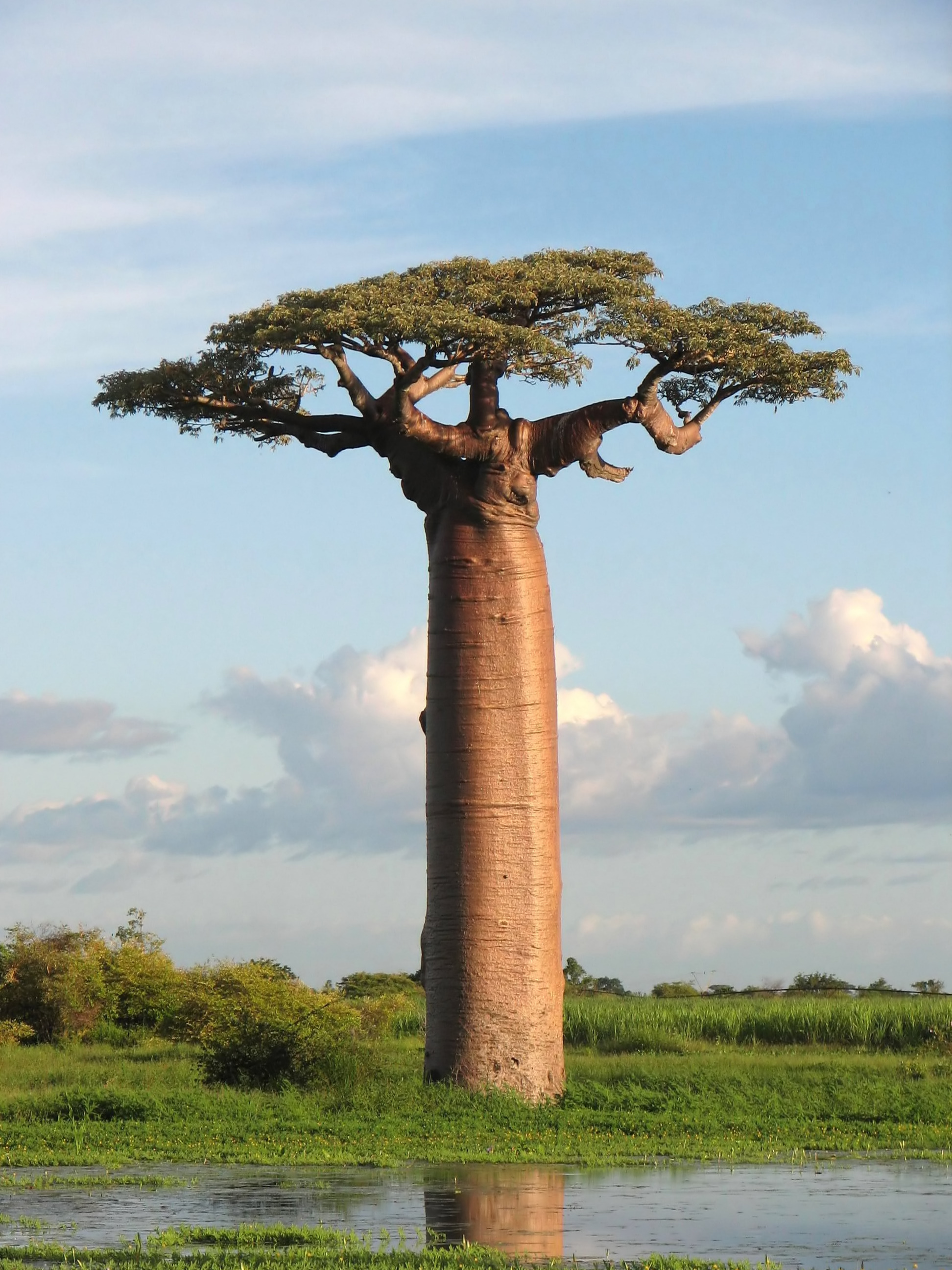
The Tree of Life is a global archetype focusing on the concept of a sacred tree.  It is a symbol that is usually associated with hope, healing, stability, sustainability, and protection.  Through history, it has occurred in many different cultures.  A few examples of the broad spectrum of cultures this symbol occurs in are as follows:


China
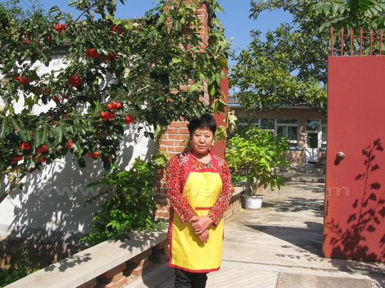
Chinese mythology tells of a peach tree that produces a single fruit every 3,000 years.  The individual that consumes the peach will achieve immortality.  It is guarded at it's base by a dragon and from it's top by a phoenix.  Here is a photo of Lady Lee standing in front of her courtyard garden. I would have wished this was a peach tree but alas it is a Hawthorn Tree.


Persia
Persian and Zoroastrinian lore maintains legend of an ancient tree called Gaokerena.  It's fruit was pressed to produce an elixir of immortality.


Celtic
"Ancient Celts called the Tree of Life crann bethadh. They believed it had specials powers. To honor the Tree of Life, Celtic people left a single, large tree in the center of fields whenever they cleared the land. They called this tree crann bethadh. Under its branches, they appointed their chieftain and held gatherings.  Because the tree provided food, medicine and shelter to people and animals, the Celts believed it had the power to take care of all life. Cutting it down was a great crime, and thus, the greatest triumph one could achieve over one's enemies was to cut down their crann bethadh."


(photo compliments of Bgag)

African
"Africans know they depend on trees for firewood, without which their wives cannot cook their food. In some areas the goats can climb trees to eat the green leaves. The leopard lurks in a leafy tree to fall upon the Lonely traveller at night, and vipers do the same in Uganda. In some trees the bees make their nest where they store honey. Every big tree has a spirit. Some trees house many spirits. Whether a tree is a spirit or is inhabited by a spirit is not an easy question. The people will say: The tree has a spirit, or: in the tree there is a spirit. The spirit has a voice which the careful listener can hear and even understand if he knows the language of the spirits. This voice has to be preserved carefully by the drum maker. The boat-maker too, wants to keep the spirit of the tree in the wood so that it will protect the boatman against drowning in the treacherous rivers, when the tree has become a boat. The appearance changes, the spirit remains. Together in a forest, the trees have a collective spirit, powerful enough to be revered as a god.

Trees can be tricky. With their roots they can trip up the unsuspecting traveller, who will often believe that his enemy bewitched the root to do that. Thorny branches have the same function. In Namibia there is a tree that is believed to eat people: it catches them with its branches, opens its bark and swallows them up. Inside the tree, the victim can be heard singing a goodbye song to their relatives and friends. Only the Woodpecker can save them, for it possesses magic powers. For a fee, it will open the tree with its sharp bill. A man in Zaire was married to a tree. It gave birth to his children, a healthy boy and a girl who were human but knew the spirits of the forest and so became famous herbalists, for it is the doctors who need the trees for their medicines."
-excerpt from A-Gallery


Mesoamerican
The Mesoamerican World Tree motifs "are a prevalent motif occurring in the mythical cosmologies, creation accounts, and iconographies of the pre-Columbian cultures of Mesoamerica. In the Mesoamerican context, world trees embodied the four cardinal directions, which also serve to represent the fourfold nature of a central world tree, a symbolic axis mundi which connects the planes of the Underworld and the sky with that of the terrestrial realm."
-excerpt from Wikipedia

Modern
Modern departures could include the iconic solitary tree that stood after the tsunamis at Fukushima or the steadfast Methusela, who has endured for some 4,845 years.  In Australia, a group of protesting sheep shearers founded the Australian Labor Party in 1891 under a Cabbage Gum Tree that has been dubbed The Tree of Knowledge.


Project Focus
Though type is not discouraged, participants are encouraged to use techniques that showcase VABC as a place that incubates visual imagery as well as typography.  Participants are challenged to convey ideas through symbology, composition, color, line, and think of ways to impart a message other than text in order to reach across language barriers.  The collection should not only be a rich visual collection of interpretations of the Tree of Life but also a showcase of printmaking technique, relief in particular.

Saturday, January 9, 2016

Welcome Home card for the Haven


I had the honor of being commissioned for a run of welcome home cards for the Haven of Charlottesville, Virginia.  I really wanted to take this opportunity to offer them something besides the standard run of the mill card.  If I'm going to be commissioned to do artisanal letterpress cards then they should really be something special!  I like to think I succeeded and I hope that the cards bring a bit of delight into the lives of the recipients.  What follows is my design process in creating these cards.

Sometimes, I feel like I'm a dinosaur when I see the generations not 5 years behind me utilizing Wacoms and digital tablets solely for sketching.  Then I see professional greats still employing good ol' paper and pencil and I don't feel so bad.  Part of becoming a "real" artist is developing a confidence in your skills and materials.  Being open to new materials and experiences is very much part of the game but refusing to have shame in the process that you're "good at" and the materials that work for you is also very much a part of establishing yourself.  I'm looking at you, Eric Powell.

So with that in mind, in order to get a true pure vision of what I want to accomplish, I sit down with my sketch pad.  I had done cards as invitations for my senior thesis at the Corcoran ages ago.  They featured two side folds so that the card opened out to the viewer on both sides.  I thought that that template would be a good concept.  The emphasis for the commission was being welcomed into the community and feeling comfort.


I wanted to pull on images of peace and being at ease.  I decided to portray a set of double doors opening up to the inside of the card that would read, "Welcome Home!"  Many of the neighborhood houses in the old districts of Charlottesville are bungalows and it is common in the south to see older houses with great southern boxwood hedges.  The house I grew up in had such boxwoods and birds would always stuff nests in between the space of the pillars and the porch roof.  Birds would flutter in and around the boxwoods and cats and dogs would often seek shelter under them in the evening heat.  I wanted the doors and porch to look old and softly worn.  


With the sketch done, I placed tracing vellum over it and stained it with some markers to get an idea of what the color blocks would look like.  I wanted a subtle color block of evening light filtering in over the porch and through the boxwoods.


The challenge of producing something like this is that when the card is closed the images need to line up to look like a whole.  The blocks themselves need to be separate so they can be printed at opposing ends of the card paper.  I had to slice a linoleum block down the middle and then tape them together while carving and pay attention the whole time to if the blocks jogged out of place in even the slightest.


After the key block image was carved, I put it on the Vandercook and proofed up a few sheets of Denril.  Denril is wonderful stuff.  The ink does not initially soak into Denril once it is printed and you can use the pressure of the press itself to transfer and image onto another block.


Here it is in progress as the cylinder presses the wet proof onto a clean block.  It's like watching magic!


Because Denril is transparent, it's a great tool to have around when doing registration lock ups.  Once the ink is dry, the proofs are invaluable this way.


Here are the blocks as they have freshly been printed.  My original concept states that there are 5 blocks for this project but if you really get technical about it there are a total of 8 individual blocks.


Here's a photo of the color blocks of the boxwoods getting carved. The key block ink gets washed off before final printing begins.

Well, there comes a time in an artist's/blogger's life when you're working and you have to make a choice.  Do I sacrifice art process accuracy or art process documentation?  When I began the final process, I realized I would need my absolute full attention the whole time.  I had to lay down the camera and put my all into producing the cards accurately.  Sorry, I didn't get any shots of the cards as they were being printed but suffice to say it was a complicated and long lock up, inking, and printing.


When I did breathe a sigh of relief that all the printing was done, I needed to then start trimming and folding.  I left excess paper around the card to have a little jogging room when lining the front image up.  For some of the trimming I could utilize the VABC's guillotine but for the final stages I had to sit down with my utility knife for a more precise cut.  There was also much scoring and bone foldering to be done.  

By the way, do as I say and not as I do.  You'll notice the big cup of tea on the desk.  It's not a great idea to have food and beverage around while you're working on paper goods but Mama needed hojicha to get the job done.  Hojicha and Genmaicha have kept me afloat more times than I can count.


Here's an image of one of the first ones completed. Yay!


Here's my proud display of 100 Haven cards completed and ready to be delivered!


A final presentation shot of the front.


Open it up for the welcome message inside!
Below is a wonderful video of the card being opened at the Haven:


Friday, January 1, 2016

Stillman & Birn, be still my heart!


I met with my friend Rhonda Roebuck for coffee a couple weeks ago and was lamenting my inability to find a field sketch book that stood up to the watercolor washes I wanted to do.  I was drooling over the journals she had completed and she recommended Stillman & Birn as her favorite company for sketch books.  Well, I am ashamed to say that I never knew we had some the Crozet Art Box!  I was quick to snag one of the last ones we had which happened to be the Epsilon Natural White Sketch book.  They are a little pricier but her results were so promising I took the plunge.  Boy howdy, what a knock out!!  Firstly, the paper is a nice 150gsm weight.  I laid down a few washes and it did buckle a bit but it didn't pucker so horribly like the Strathmore sketch books I've been using.  Here is the true beauty: after the initial washes dried, I began to work into the drawing. I added colored pencil and rubbed it around. I added Caran'dache Neocolors and pushed them around with some water.  I think I added media about 4 times and then either erased back with a Magic Rub or lifted out with water to create a rich surface.  This paper stood up to it without pilling or bleeding.  I am tres impressed!  I have to say I never expected such outstanding performance from a sketch book.  It was worth every penny! I feel like I've been waiting for years to lay down some of the ideas in my head and this little book came along and said, "Hell, yes! I'm down. Let's do this! Bring it!"


Friday, November 27, 2015

The Scottsville Supply Company logo project


Here's a look at a recent commission I completed for the Scottsville Supply Company!


I really had a blast with this project and I'm excited that there will be a local shop for beekeeping supplies and other goodies in Scottsville now.  Beekeeping has really taken off in our area.  Nelson is the perfect place for small farming, beer and wine brewing, and beekeeping.  We're so blessed to be able to cultivate such a rich diversity here!


I would be lost without my sketchbook.  Virtually everything in my creative process starts here.  I learned the valuable lesson at the Corcoran that if you don't like a particular piece when you finish, you could always do it again.  I don't know why that never occurred to me in high school.  That concept seemed to go against my grain early on.  Now, I'll slice and dice, and redo, and redo again if need be.  I probably got used to it after running through proof after proof in printmaking. At any rate, I started drawing the goat for the goat cart logo and realized the perspective was wrong.  Rather than get rid of the drawing that I actually kind of liked, I just tore it down the middle and started the revised version underneath.


I worked on the logo font with some tracing vellum on the other blank half.  This kept all the work together and I didn't have to sacrifice any of the pages of my sketch book.


Above is the image transfer onto the block, awaiting to be cut.


Here's the finished bee skep block.  Black marker helped me see the contrast as I carved.  It looks pretty now but once we ink it up and clean it a few times it will get muddled.


Loaded the finished goat cart design onto the VABC's Vandercook letterpress for a few proofs.


They look nice and crisp coming on the cylinder of the Vandercook.


Here are the blocks drying after being proofed and cleaned.  I'll be pulling a few for a limited print run after I decide on colors. In the meantime, check out the Scottsville Supply Company website or better yet, visit them in Scottsville, VA for a delightful time!  You can pick up some of my letterpress cards and gift tags while you're there!

Sunday, August 16, 2015

A little plein air


I did a little field study at my family's farm property.  There were many wild flowers in bloom and it was a beautiful day.  I took the back road that follows the Rockfish River to get there because it makes you slow down and enjoy the scenery.  The air was thick with the fragrance of passion flower.  The sumac were in bloom and the Queen Anne's Lace was nodding in the pasture.  I stopped to draw a particular specimen that caught my eye.  I did not know that NeoColor water soluable crayons will melt in the sun but now I do!