After wading through a New Year's Day hangover, I set about my goal of beginning the final printing of my Trilobite Series for the show I have due in April. My goal was 5 editions for each trilobite I had the color block and key block finished for an edition of 30 prints each (so I would have to print 35 all together to account for mistakes). This was to be completed by the end of the weekend. I already had the paper cut and resting in my plastic humidor box. I had begun the printing back in October when I was intent on printing with my soil ink. That would have been such a great print. Alas, it was not in the stars and so rather than waste resources I dried out the remaining paper and set the project aside to deal with the hell of moving out of my studio. I still have the "ink" I processed from soil. Maybe one day I will print with it.
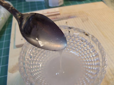
I got up this past Saturday and set up my printing station/drafting table. I have a canister of premade McClain's brand nori paste but when I reached for it I saw that it was getting on the low side. I decided that if I'm going to go with the Amazonite and Malachite pigments that I might as well roll out the process and cook up my own paste too. I had purchased a bag of rice starch that I keep in a cobalt blue apothecary jar and it that makes it feel like my little treasure. I'm still keeping an eye out for a suitable steamer trunk to keep all my preground pigments in so I can really pile on the atmosphere. I trotted down to the kitchen with my tattered copy of "Japanese Book Binding" by Kojiro Ikegami and my mysterious blue jar and my husband asked if I was cooking up potions today. I should have taken a picture of the nori steaming and bubbling away on my stove but the truth of the matter is I didn't want to photograph the spaghetti sauce stains that were splattered on the stove top as well!

Now, there have been several reasons that I have put off printing these little guys in the past. The number one reason was "What if the soil pigment didn't work?" and that reason has been scratched off because low and behold it didn't. The next was "I need to spend more time sketching and carving." True but time is a wasting and deadlines they are a coming. There was also "What if the paper doesn't work or the Malachite or Amazonite pigments don't work out? What if your registration is a nightmare?!?!" Well, the only way to know is to just get down to it.
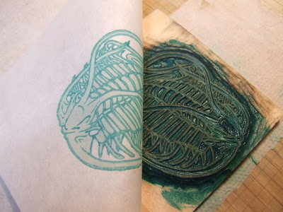
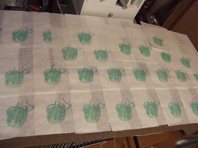
I had forgotten that I had already printed up the color block for Norwoodia in Amazonite and those prints had been dried. Even though my kento should be on point I was nervous about rewetting prints that had been dry for a few months and expecting the key block to just line up like magic.....but you know what? It did. Yay! I took that as a good omen and so I began trucking along with my little print set up cranking out my army of 35 Norwoodia.
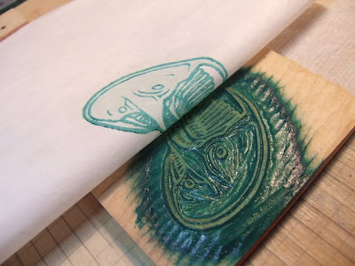
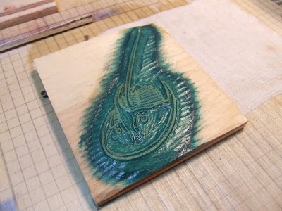
Here is Norwoodia peeking out from under his blanket of Kozo.
I was impressed at how deep and rich the Amazonite color was. It is a mineral native to Virginia and can be found in jewelry but Daniel Smith has taken to grinding it into pigment and I would have never thought that the color would be so vibrant. The light fastness is supposed to be superb and I'm glad because I'm always expecting colors like that to photo-degrade. Sadly, I don't think the pigment was from Virginia. I think it was from Russia but at least it is the same mineral.
Though the colors were as I expected them, I found them lack luster for some reason. In painting class, I remember being warned repeatedly that the colors change when they dry so that don't appear as vibrant in their dry phase as when with their wet phase. I was pleasantly surprised to find that I liked the prints more when they dried than when they were wet. The pigment took on a soft glow and lost the dull flatness it had when wet. I wonder if this is due to in part because they are mineral pigments. I'm more willing to bet that it is that special magic that Japanese Washi paper possesses. Colors just bounce and glow within it.
I was almost finished with the Norwoodia edition when it began to get cold in my little room. I thought this was due to handling all the wet paper and ink but upon inspecting the thermostat it was confirmed that our heat was on the fritz. Some people don't think 56 degrees is cold but I HATE being cold and consider the thermostat being on 72 a sacrifice for the sake of the planet. I'm getting a wood stove the first chance I get. Anyways, I felt like this would be another potential excuse. "Oops, the heat's not working pack it in and save it for another day that we can think of something else to procrastinate about." I had already wet all this paper and cooked up fresh nori. It was just time to make a kettle of hot tea and keep on truck'n.
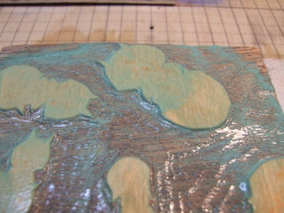
Up next were the little tiny trilobites called Angnostoidea. These guys were somewhat of a pain because I was actually printing a grouping 6 trilobites and so had to watch the registration. Even though most of the time the Malachite (lighter shade) pigment printed up dark it was hard to see on the plate as it was very pale and I was worried that I didn't have enough pigment on. I'd add more and then worry if I was flooding the block.

At the end of the day, I had my two little armies of Agnostoidea and Norwoodia and I called it quits because my fingers were frozen. The next day I printed up one of my favorite trilobites Ensifer.
All of its wandering whipping appendages made me cringe with the registration ahead but all went well and I am happy with my small army of Ensifers.
I printed the color block for another of my trilobites but ran out of steam....and heat for the day. But tomorrow morning the trilobites and I will emerge well rested and ready for another day of printing!