I am very excited to post about the first page of the Book of Life! This is just a proof and there are things that happened during proofing that I need to go back and fix but as a printer, these are the moments I live for. I hope no one thinks I am boasting but when I pulled the first impression off the block it felt like I was instantly whisked back in time to old Europe in a print shop where I could see through Albrecht Dürer's eyes. You spend all this time breathing life into a woodblock and then during printing, in an instant, it breaths life into you! Very rewarding.
The few fixes I will make that catch my eye are the shallow scuffing that prints up in the sun's rays, the errant scuffing in the border, and rework the shadow of the storm on the water so that the transition is not so blunt and heavy. Other than that, I am in love! And it only gets better as I figure out which color blocks I would like to make!
And now for a lesson in give and take. There will be two editions from this series. I love black and white prints but I also love color prints. One of the effects I wish to imbue to the reader of this book is the feeling of time and the ancient feeling associated with woodblocks while at the same time having the subject matter being relative to today's present knowledge and maybe even relevant to the future. I am making two editions: 1. an Alchemist's Edition and 2. a regular (color) edition. The Alchemist's edition will have the black and white imagery and maybe the edition of dark red symbols. This being said, when I went to carve the boarder of the first page I had real trouble. Either I was physically too tired (I wear magnifying specs when I carve and the proximity of it was starting to catch up to me after a few weeks) or the wood was not going to cooperate (there were some areas of grain in the poplar that were too gapped for my delicate cuts). At any rate, I was tired of fighting but more importantly I had a deadline to reach. I had been thinking about the border anyway and my previous design of water molecules felt uncreative even though I labored over the task. I finally decided that I would do a design with an 8 pointed star with two split diamond shapes snugged into its sides to represent water molecules. I carved out a stamp and set the design into the border (I had done this too for the other design with failed results). After initial niddling, it just wasn't happening and I decided to simply carve out the border and approach the stars again from a color block aspect. I am hoping to carve the red color block for the Alchemist's edition in such a way that I have the option of printing the border in black if I wish. I'm telling myself that I will like it better this way anyway. I hope I am right!
Saturday, December 19, 2020
Book of Life: Page One
I am very excited to post about the first page of the Book of Life! This is just a proof and there are things that happened during proofing that I need to go back and fix but as a printer, these are the moments I live for. I hope no one thinks I am boasting but when I pulled the first impression off the block it felt like I was instantly whisked back in time to old Europe in a print shop where I could see through Albrecht Dürer's eyes. You spend all this time breathing life into a woodblock and then during printing, in an instant, it breaths life into you! Very rewarding.
The few fixes I will make that catch my eye are the shallow scuffing that prints up in the sun's rays, the errant scuffing in the border, and rework the shadow of the storm on the water so that the transition is not so blunt and heavy. Other than that, I am in love! And it only gets better as I figure out which color blocks I would like to make!
And now for a lesson in give and take. There will be two editions from this series. I love black and white prints but I also love color prints. One of the effects I wish to imbue to the reader of this book is the feeling of time and the ancient feeling associated with woodblocks while at the same time having the subject matter being relative to today's present knowledge and maybe even relevant to the future. I am making two editions: 1. an Alchemist's Edition and 2. a regular (color) edition. The Alchemist's edition will have the black and white imagery and maybe the edition of dark red symbols. This being said, when I went to carve the boarder of the first page I had real trouble. Either I was physically too tired (I wear magnifying specs when I carve and the proximity of it was starting to catch up to me after a few weeks) or the wood was not going to cooperate (there were some areas of grain in the poplar that were too gapped for my delicate cuts). At any rate, I was tired of fighting but more importantly I had a deadline to reach. I had been thinking about the border anyway and my previous design of water molecules felt uncreative even though I labored over the task. I finally decided that I would do a design with an 8 pointed star with two split diamond shapes snugged into its sides to represent water molecules. I carved out a stamp and set the design into the border (I had done this too for the other design with failed results). After initial niddling, it just wasn't happening and I decided to simply carve out the border and approach the stars again from a color block aspect. I am hoping to carve the red color block for the Alchemist's edition in such a way that I have the option of printing the border in black if I wish. I'm telling myself that I will like it better this way anyway. I hope I am right!
Sunday, April 5, 2020
Homemade Bandana Mask
I know this is off topic but it's not every day you live during a pandemic.
I found this technique on the internet but there was no way to fasten it behind your head. The hair ties were not connected and I just so happen to remember how to bind them so I made this video of them linked together. It can be a little tight so try and stretch the bands before hand so they don't break. I had to film this one handed because I don't have a camera stand but the basic information gets across.

Here's what the end result should look like. Tuck the ends of the bandana flat. These will rest against your face.

This is what it will look like on. Stay safe everyone!
Saturday, January 26, 2019
88 Works

When I attended the Corcoran waaaaaaaay back in the day, we had an assignment called 88 Works. It was an exercise designed to help students develop artistically through discovering what their stylistic tendencies were. It's a great exercise to do but it's pretty intense if you have trouble turning things around quick like I do. But, part of the learning process is to let go of perfection and just do so that what falls out are the root tendencies of your own personal style and aesthetic. A while ago I felt like I needed to revisit an exercise like this but couldn't find it anywhere. When I was in school the rumor was that this project was a distillation of a previous iteration called 100 or 120 works. Wow! Years after I graduated I heard that it was whittled down to 50 works. To my delight, I was tidying up (thanks, Mrs. Kondo!) and I found my original copy of 88 Works. I know I had done a search with no success in the past and I was thinking that maybe there are others out there who would like a copy of this exercise to give them an inspirational jolt so here it is:

88 Works
(in 100 days)
- Be Open
- Be Quick
- Be Intuitive
- Be Experimental
- Be Imaginative
- Use as wide a variety of materials and processes as possible
- Don’t be judgmental
- Remember: You are gathering information, gaining experience, not producing “works of art”
After the 88 works, the faculty will work with you to pull information out of this experience. Have fun, work hard.
- Drawing of the inside of your mouth
- Sculpture of the inside of your mouth
- Painting of top view of your head
- Drawing from an object
- A drawing without space
- __________________________
- __________________________
- 3-D landscape
- 3-D modeled
- A painted object
- Drawing as a fantasy map
- __________________________
- A nonobjective drawing
- A black and white drawing (dry)
- A black and white drawing (wet)
- A black and white photo (you shoot)
- A photocopy
- 3-D carved
- __________________________
- 3-D thick and thin wire
- 3-D with movement (kinetic)
- __________________________
- __________________________
- A collage from image-sorting trio(s)
- A book
- __________________________
- A monochrome painting
- A transparent painting
- __________________________
- A monoprint
- A drawing from life
- 3-D from life
- 3-D an African headdress
- 3-D as a weapon
- __________________________
- Painting like a photo
- Drawing by abstracting another work (of yours)
- Oil painting of bottom of your shoe (sole)
- Acrylic painting as puzzle
- __________________________
- A micro-drawing
- 3-D paper
- 3-D like a drawing
- Spin art painting
- Painting using a stencil
- Acrylic over wet oil painting
- Painting with a front and back
- 3-D like a painting
- Drawing as a symbol
- 3-D as a symbol
- __________________________
- Painting as romantic landscape
- Drawing as an illness
- 3-D as a shelter
- 3-D assemblage
- Drawing like a sculpture
- 3-D, a found object
- 3-D from photographs
- A painting made up of units
- __________________________
- 3-D made up of units
- 3-D as narrative
- Painting as narrative
- Painting, non-rectangular format
- 3-D as doll furniture
- Painting with a stick
- Painting without paint
- 3-D within a cube
- __________________________
- Drawing from a dream
- 3-D from the same dream
- a color photo (you shoot)
- Drawing with text (words)
- __________________________
- 3-D as toy
- A drawing from memory
- 3-D with text (words)
- A drawing from a poem
- __________________________
- 3-D as a package
- 3-D as a tool
- A drawing of the hand you write with
- 3-D with an arc and a curve
- A poem of a drawing
- A thin painting
- 3-D an object with no history
- Drawing as a political/social statement
- __________________________
Saturday, July 15, 2017
NSFW Watercolor Test

So, our Schmincke rep was showing us the new product line for the season and gave me a sample card of 35 new colors Schmincke is releasing. Now, anybody who talks to me about watercolor for any length of time will know that typically I'm a Sennelier whore. BUT, I am going to have to concede to Schmincke Horadam. I REALLY love their product. It is more expensive but damn it rarely lets you down and just like Sennelier, the expense is taken up in the quality of the product so it is you will hardly regret the investment in the long run.
I believe making art should be a passionate experience that moves you. So, me being me, art supplies are like any other experience in life that involves pleasure. My visceral initial reaction is cursing. So, if my initial response is blatant cursing, then you know it's awesome. The longer the string of expletives, odds are, the more tremendous the fabulousness. Thus, I tested these in the privacy of my own home, you've been warned, and I hope I didn't offend/scare the neighbors too much.


First to try was the Rutile Yellow. Okay, take in a pregnant pause because I had to laugh at myself. I worked for a while at Lynne Goldman Studio and therefore came away with more knowledge about gemstones and minerals than I had previous. I LOVE rutilated quartz and the name immediately turned me on. It would be good to mention now that I've seen other companies as of recent come out with new colors called "rutile (fill in the blank)" and I'm going oooooh, this must be something new and interesting; a new naples yellow maybe? As I'm reconstituting it, the color is rich as always but my mind is going, Huh, the smoothness of this and the opacity feels like titanium. A little research tells me that Rutile is the term in mineralogy circles to refer to Titanium Dioxide. So, calling this paint Rutile Yellow is like saying Rice Krispies are gluten free. . .duh. This kind of feels like a cheap trick and a slap in the face from Schmincke but seeing as their paints are the hot shit, I'll let them slap me around.

You'll never really be disappointed by their line of Quinacridones. That yellow is just fucking hot! It goes from brown to vibrant golden yellow stain in no time flat, like a good race car. In fact, Quinacridones were originally developed to be car paint.

I'm keen to get my hands on their Geranium Red, Yellow Orange, and Saturn Red. They are intense and their saturation remains when they dry. My only complaint is the proprietary naming . . .

The Perylenes are some hot fucking shit! Goddamn!! The solid easily mixes into a creamy rich opaque paint that disperses in water similar to an occluded IV. I know, attractive image, right? Well, that's the only thing that came to mind as I was mixing up these beauties. The heavy pigment load crept through the clear water in strong tendrils like poison . . . and that's hot. Upon drying, they are still strong and uniform and moody and I'd love to grab these for staining. If I could only have one I'd choose Perylene Green because sonnuvubitch that shit is tight. I haven't experimented with lifting them yet. I fell down the rabbit hole trying to get a good definition for Perylene. All I got was that they are a dye based on rylene framework of naphthalene. I wondered if naphthalene referred to some paint and yes, they were also developed as an automotive paint dye. I tried to track down something more definitive for us laymen but as I lack a chemistry degree, I didn't get very far.

Some colors I noticed on the chart of new releases included Viridian, Phthalo Sapphire Blue, and French Ultramarine. I would like to know what the fuck that is about because I know damn well Schmincke has had Viridian and Ultramarine. There's no way these could be "new colors." I find it hard to believe they would just now be getting around to creating a French Ultramarine grind but whatever. So, I don't understand why Viridian would make it to their new color release. Is it a new formula or something? I did a test vs. Daniel Smith and Sennelier. Sennelier came out on top. (Yes, yes. That's my baby. No, no. I don't mean maybe.) I find it rare for Schmincke to fall flat but there you go. The Phthalo Sapphire Blue is crazy fantastic though and I would endeavor to add it to my collection.

I have Sennelier's Green Gold but Schmincke's Green Gold is slightly brighter in the yellow department so I'd grab that too if given the chance. You sexy minx, you.

Now, normally gimmick colors piss me off. Proprietary naming irritates the shit out of me because it teaches people to be lazy and not learn how to mix color. (Geranium Red, gimme a break. I'm looking at you Saturn Red, otherwise known as Vermillion.) I'll usually flip a tube over and look for the pigment numbers to see if I'm right in guessing what's in there. That said, when I tried Potter's Pink, I said "HOLY FUCKING SHIT!!!" That subtle color is hard to beat but the almost immediate granulation is reason alone to use it.

Lastly, the Brilliant Opera Rose is pretty unique. I have Holbein Opera and I'm not a huge Holbein fan (They use proprietary names like it's going out of style . . . which I hope it will.) but Opera and Quinacridone Gold are BANG'N. (And yes, it is a fluke but I would choose Holbein's Quinacridone Gold over Schmincke's.) Schmincke's Opera Rose is rich and pigment saturated but I notice that it separates into a fluorescent dye and a lesser magenta. I find that trait haunting and unexpectedly magical. This habit would really create some luminous depth so I will be adding this color to my collection as well.

While I was at it, I broke out my Daniel Smith Primatek test sheet out too.

Right away, the Sodalite Genuine is some hot fucking shit. I'm really digging it as a blue black. It is earthy and moody and the way the sediments rest on the paper is magic.

Green Apatite Genuine and Serpentine Genuine are really tempting, rich, subtle green tones. Vibrant greens are hard to mix and taking a look at my pallet is funny. I am a true human in that I have a big collection of green paints. I usually prefer to mix my own paints vs. buy a tint or shade but mixing greens is tricky and the results on your own aren't that stellar so when I see a new green I snap it up. These two are lovely and unique and would add something quite different apart from your average olives and sap greens. This advice comes from a self professed paint hoarder. You've been warned.

I'm not ready to trust Amethyst Genuine. Calling back to my Lynne Goldman Studio days again, I know that Amethyst naturally is one of those minerals that actually fades into clear quartz under UV rays. Daniel Smith rates it with superior lightfast capabilities. So . . . what did you add in there to make it lightfast, Daniel? Also, the little sparkly bits piss me off. Did you add mica too, Daniel? Don't piss down my back and tell me it's raining, Daniel!!!! I'm watching you . . .

And then there's Sugilite Genuine. Lie to me Daniel. Just, go ahead and lie to me . . . and I will believe you. Simply for the fact that this paint looks like labradorite in a tube, I will buy it and use it with blissful ignorance. I will love every last one of those fucking sparkly bits. Sugilite is supposed to be extremely rare as a mineral so I have a feeling Daniel be lying to me. But you know, for now, I'm okay with that.
Goddamn.
Now, I need a glass of wine . . .
Sunday, June 12, 2016
Corvus sanzuwu
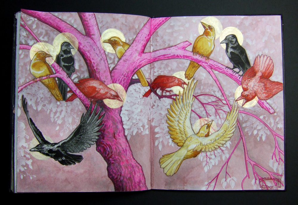
I can't believe I did it! I finished it in two weeks! My friend Lyall Harris asked if I would be interested in participating in Strathmore's Pass the Journal event. It is an international round robin of sorts and each artist has exactly two weeks to decorate a two page spread however they like. It was exciting to receive the journal but also a little intimidating. I wasn't sure what I was going to draw on my pages. At first I thought I might sit on the downtown mall and sketch some of the buildings or draw some of the letterpress machines at VABC.
It just so happens that near to the day I got the journal I had a meeting scheduled with my other friend, Debbie Ku. We were talking about our upcoming participation in the Tree of Life print exchange. We were both thinking of addressing the Chinese concept of the Tree of Life. She told me about Xi Wangmu (Queen Mother of the West) and the Fusang mulberry tree in the valley in the west. One note caught my eye and I researched a little more into Sanzuwu, the three legged bird. The most popular account is of Yangwu or the "golden crow". An account read, "Even though it is described as a crow or raven, it is usually colored red instead of black." It was stated that there were originally 10 separate sun crows and each would take turns accompanying Xi Wangmu across the world in a carriage. Legend tells that in 2170 BC, all the crows decided to escape and land on earth to feast on two kinds of mythical grass. This caused the world to burn and in order to save the day Houyi, the celestial archer, shot all but one of the sun crows with arrows. Can you guess which one remained?

I was so inspired by this fantastic tale that I sat down with my pencil and began to map out Fusang with its branches full of Sanzuwu. I was really excited at the beginning of this process! I had to search for a lot of references and kept a closer eye on the crows that like to visit the house.

Finally, I had the finished sketch but now a week had gone by and I was getting nervous about finishing the work.

Here's a close up of things in progress. I was starting to feel like a failure because I was finding the tree really hard to paint. I didn't have many references on how to light and shade a glowing hot pink mulberry tree with translucent white leaves! I decided to start rendering the birds instead and this really helped relax my hand and get into finishing the whole thing.

This was the first time I used my quinacridone red and gold paints. The quinacridone red came out a nice hot pink. The quinacridone gold I'm hook on. It went on as this thick rich golden ochre color and then would thin out to this luscious mango yellow tone. Sexy. The finishing touches are translucent gold halos. I was really excited to try out Golden's Interference Gold paint. For the finished shot of the painting, I propped one side of the book up so that all the halos would be illuminated. As you can see from the image above, in certain angles the halos virtually disappear. I took a scan of the journal before sending it off and the halos don't really show up in the scan.
This was a really great project to do and made me commit to painting a drawing again. That was refreshing. Now, on to that Tree of Life block print that I need to do . . .
Tuesday, March 29, 2016
The Tree of Life VABC print exchange
2nd Meeting
VABC shop studio Saturday, April 16th at 5:00pm

What it is: A collection of prints created by participants and inspired by the concept of the Tree of Life. The Tree of Life is a global archetype focusing on the concept of a sacred tree. It is a symbol that is usually associated with hope, healing, stability, sustainability, and protection. Through history, it has occurred in many different cultures.
Edition Goal: Enough prints to accommodate a final portfolio collection in a hardbound case for each participating member and a determined number of cases for donation to the VABC.
Print Size: 11” x 14”
Paper Type: Paper is the choice of the artist.
Participation Fee: Members: $40.00
Non-members: $70.00
Medium: “Traditional” printing methods are
encouraged but the project is not exclusive of digital methods. Contemporary media can be used and is encouraged but be considerate. Methods and materials that compromise the collection as a whole will be excluded.
Please contact project manager, Lana Lambert for more information at lanalambertpress@gmail.com
Sunday, March 27, 2016
Crozet Artisan Depot

I got into a new local venue! Literally! The Crozet Artisan Depot took me on as one of their new artisans and I am delighted to join them. They are located in a fantastically quaint old train station in downtown Crozet, Virginia. It is jam-packed with wonderful art of all kinds! There are pieces to delight the senses and pamper the soul. Naturally, some of them followed me home . . .

Below is a photo of my cards nestled amongst all the goodies.

I've got so many more to get printed but fresh off the presses are the stacks of boxed Thank You cards. I have some singles for sale too. Sometimes just one will do!


I cannot impress enough how delightful the Crozet Artisan Depot selection is! You can find paintings, prints, ceramics, baskets, wooden bowls, jewelry, stationery, books, candles, soap, knives, instruments, candy, preserves, . . . I mean the list goes on and on!

The staff is really great as well. I met a luthier who makes some amazing instruments! Marvin Rankin creates these beautiful masterpieces, but it doesn't end there. Not only beautiful to look upon, in the right hands they create aural magic as well.

These two really stood out to me. I've never seen an electric cigar box guitar. He even has an amp under the display for a demonstration of the sound. Stellar! See more of his work here: crozetartisandepot.com/#!marvinr/ckku

I had to come away with some goodies! I picked up this gem by Emily Hancock. The binding is delicately crafted and it was hard to pick from her selection because they all looked so tempting. At last I chose this little beauty because the bright marble paper reminded me of an Easter egg shell. I added the title at the top right on the front to personalize it just for me. Check out Emily at www.stbrigidpress.net/

While perusing, I recognized this collection right away! It's hard to miss the unmistakable precision and soul of Abbey Noelle's carefully rendered graphite animal portraits. I recognized her work as she has framed with us at Creative Framing. I've seen adorable little "Coffie the Fruit Bat" in person and the detail is crazy. I bought one of her cards to remember him. I know he hangs upside down but I like looking at his little face right side up! You can find out more at:

I actually met the lovely Kerensa of Lux Aromatica when she had an opening this past 2nd Saturday. I simply had to try some of her wares and boy, was I not disappointed! I'm going back for more. For now, I'm enjoying one of her Ice Mint soaps (mint soap is a weakness of mine!) and wonderfully fresh French Perfume candle. I want to try Rare Earth and Kama Sutra next. You can see more at:
Well, I better get back to cranking the press handle but stop on by the Crozet Artisan Depot to check out the fantastic collection of locally crafted treats! Be warned, it's hard not to come away with something that you won't absolutely fall in love with!
Subscribe to:
Posts (Atom)